Recently I downloaded the session submissions report from the SQLSaturday Admin site, it was time to work on the schedule. But first I must upload it into my SQLSat480 database. I like having a database year over year and I just love to play with data. So I ran some queries to give me information about my submissions. While relaying these details to my husband I declared “I need to put this into PowerBI”. When he got home from work he was able to see what it was I had created and said “so what did that take you like half an hour”, “Pffft!” I said, “like 10 minutes”. On the first time through I connected directly to my database, in this sample I am going to import the data into excel.
Step 1 Download Data
Download the Submitted Sessions report from the reporting menu on the SQLSaturday admin site. Don’t worry about opening the data to fix anything and trust me I know what kind of silly things SSRS does to the layout of a report in excel. Save the file locally as Excel. (Image 1 below)
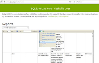
Image 01
Step 2 Launch PowerBI & Get Data
Launch the PowerBI desktop application and select Get Data. Select File on the left and choose Excel from the middle options, then click Connect (Image 2 below). Now use the standard window popup to navigate to the file you saved in step 1.
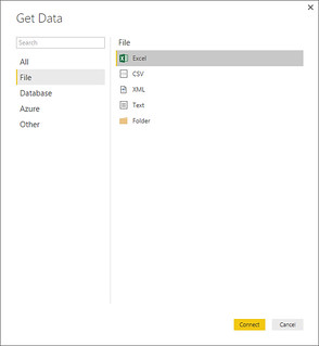
Image 02
Step 3 Preview Data
In the Navigator window, select your file on the left, a preview will load in the right hand pane. (For privacy I will not show you the data preview) Now select [EDIT] at the bottom.
Step 4 Editing Data
From here we will walk through several steps to get your data in order to use in a dashboard.
- From the HOME menu ribbon select Remove Top Rows drop down chooser and Remove Top rows. You will get a pop up Remove Top Rows asking you how many rows you’d like to remove enter 1 and select [ok]. This will remove the tile row from your data. (Image 3 below)
- Now select Use First Row As Headers from the Home menu ribbon. This will promote the first row of the data set to being the header row.
- Remove columns you don’t need by selecting the column and using the Remove Columns in the HOME menu ribbon. If you want to remove more than one column select the Choose Columns in the Home menu ribbon. A pop-up will give you a complete list of the columns and you can easily uncheck them there. I will be removing Email, Column12 (artifact of SSRS formatting),Status, Phone, Country (mine are all the same), Address1, Address2, Phone.
- I know I want to make a map later, since I am in the US the Region column is actually State. Scroll over to Region and rename the column to State. Select the column and right click, rename.
- We are done editing our data, select Close & Apply from the HOME menu ribbon.
- After a few seconds your data fields will appear on the right and you’ll be ready to build your dashboard. (Image 4 below)
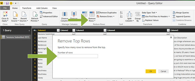
Image 03
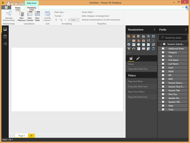
Image 04
Step 5 Adding an Image
You want to make your dashboard pretty so why not add your SQLSaturday Logo? From the HOME menu ribbon and select Image. Use your pop-up to navigate to the location of your image. Resize as desired. As a newer feature you can add images and even newer is the ability to overlap items. Remember how annoying that is in SSRS? (Results in Image 6 Below)
Step 6 Funnel of Tracks
Select the funnel from the visualizations (1), select track in the field list (2) and drag track to the values box (3). (Image 5 below) Now we need to customize this visualization. Select the paint brush to edit. (Image 6 below) I recommend giving each of the tracks a different color. Since Tracks are determined by the organizer the data maybe similar so you might want to use the same colors for more than one data point. You should also update the title Count of Tracks by Track sounds silly. Now we have a lovely display of session distribution by track.
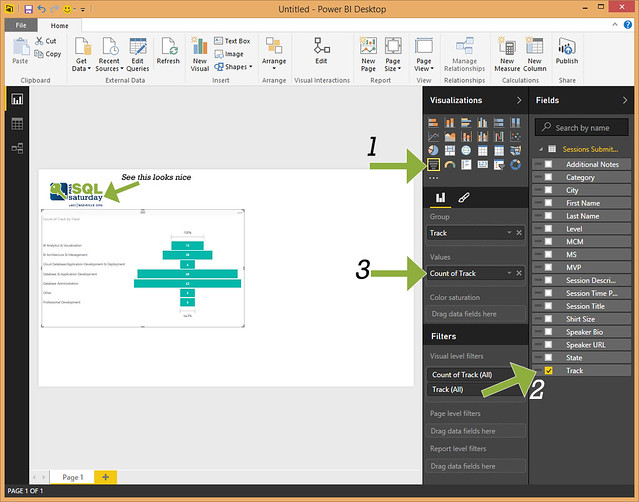
Image 05
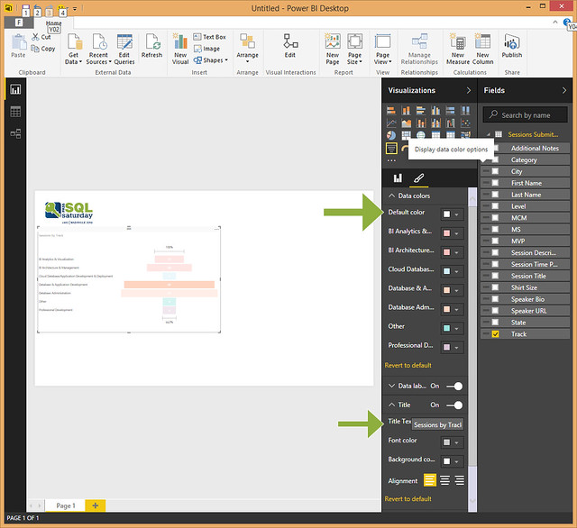
Image 06
Step 7 Sessions by level
Let’s add a Doughnut chart to display the breakdown of sessions by difficulty level. Select doughnut chart from the visualizations, select level from the fields list and drag fields to the values (just like above). Again you will want to change the title and update the colors. Now you have a visual of sessions by level and it’s interactive. Click on one of the pieces and watch what happens to your funnel graph.
Step 8 Sessions by MVPs
For this select pie chart from visualizations, select MVP and drag MVP to Values. Now you can update the colors and title.
Step 9 Sessions by State
Just for fun I wanted to “see” where all of my submissions were coming from. Select Map from the visualizations, select State from the fields chooser and drag Session Title to Values. You will want to update the colors and title like before. Now you have an interactive dashboard showing you everything you wanted to know about your submitted sessions. You can easily use different visualizations than the ones I picked, I am sure no one really likes a pie chart. The fun thing is that for the most part once you set up the visualization you can easily select it in the dashboard and change it to something else. When I showed this to my non-IT father he was really excited at how the data/displays change when you click on things. Can you imagine if you could make something useful for everyone? (Image 7 below)
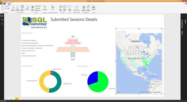
Image 07
Step 10 Final Product
After finishing my dashboard I didn’t like it so I made a few more adjustments. (Image 8 below) I displayed this at our hands-on PowerBI meeting for the NashBI ( TWITTER | WEB ) user group in December. It was brought to my attention that this was “ugly”. So here is my challenge to you, if you think it is ugly go play with PowerBI desktop and make something prettier, if you think it is lovely I think you should create one too. I find PowerBI so much fun and easy to work with that I could easily sit for hours and make stuff up.
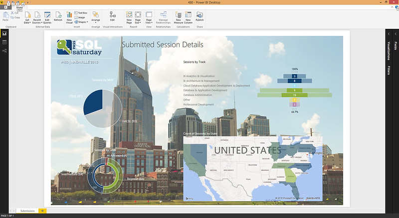
Image 08
[…] Tamera Clark analyzes SQL Saturday Nashville data: […]