There are spells where I am inside SSRS daily and then there are some stretches of time where I wrapped up doing other things and don’t see SSRS for months on end. I always seem “surprised” when I forget some of SSRS’s behaviors. I am sure sometimes I am just pushing the bad out of my head and other times it might be that I just don’t use it often enough to keep that info close to the top of my stack. So I decided that I should start a small blog series as a gentle reminder to myself and maybe along the way it will help someone else.
Custom Color Palette
I was working on some custom SCSM reports for a client–I was subcontracting from a consulting firm–there was a lack of requirements, especially in the design. I was adding charts and of course the color palettes available are almost hideous. That is when I remembered that I could go create a custom palette of colors to use. I fire up Adobe PhotoShop, import a screen shot of the client’s website and use the color picker to identify a set of colors that I want to use. I know that a lot of companies have a defined logo/color palette but since that wasn’t available this was the next best thing. The best part is this is a simple task but it has a huge impact
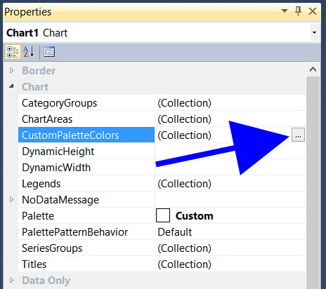
After adding a chart to your report find Chart section the Properties Window. Select the ellipsis after CustomPaletteColors. (image below)
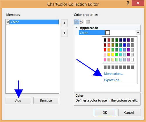
You’ll get a popup window ChartColor Collection Editor. The left window allows you to mange the order the colors will be used; the right window is how you identify the colors. Select Add to place additional colors. When you pick the the drop down arrow for the color, you are presented options: a set of available colors, More colors and Expression. (image below)
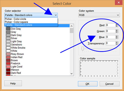
After selecting More Colors you are given another popup window, Select Color. From here, you have the option to choose which color selector you are going to use, including a standard color list (default). Since I had the colors defined, entering the RGB numbers is the best option. You must click add and define each color you want used in your chart. (image below)
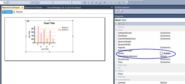
Now that you have defined a custom color palette you must tell the chart to use it. In the Properties window, under Chart find Palette, from the chooser select Custom. You can see that the chart is automatically updated with the new colors. (image below)
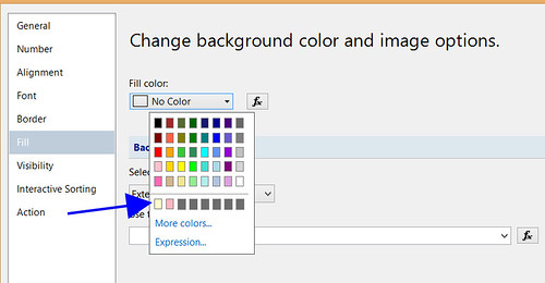
After you have defined colors for a custom palette they become available for use in other places. In the image below there is a horizontal line; below it are the 2 custom colors that were set up in the above example. This is the fill properties on a text box. This however doesn’t work the other direction, for example if you add a color from the fill properties it doesn’t become available in the CustomPaletteColors. It is available in other choosers like: text box fill, text color and background fill. (image below)
Other random musings. If you delete the chart the custom palette disappears with it. If you know you are going to create multiple reports with charts needing the same custom color palette you could create a blank report with a chart, define the custom palette and save it as a template. You don’t have to set up data sets or sources, just select cancel when that comes up.
Excellent, thank you!